
Pantone, the master colour authority, unveiled last week its Fashion Colour Trend Report for London Fashion Week Spring-Summer 2022. The top ten colours as well as the five core classic colours forecasted for LFW SS2022 were chosen as complement and contrast. Varying from light pastels to bright tones, the colours reflect sentiments of simplicity and spontaneity.
When it comes to colour, Pantone is the official global authority: the institution is responsible for helping a huge number of people around the world define, communicate, and control colour through its products and services. The American colour firm actually started as a commercial printing company, funded by the brothers Mervin and Jesse Levine in the 1950s. Lawrence Herbert was later hired by the Levine brothers in 1956 and, using his knowledge of chemistry, started to systematize the stock of pigments and the enterprise’s production of coloured inks, generating high profits. In 1962, Herbert purchased the technological assets of the business from the two brothers and decided to rename it “Pantone”.
Revolutionizing the printing industry, Pantone created in 1962 its Pantone Matching System, “an innovative tool allowing for the faithful selection, articulation and reproduction of consistent, accurate color anywhere in the world”. This arrangement allows colour standards to be organized under Pantone’s iconic letter-numeric system and chip format. By systemizing colours the way Pantone does, industries like textile, interior, architectural, design, apparel, and beauty are able to precisely achieve colour consistency over a number of materials and finishes in a manner never seen before. The company’s colour language comprehends over 10,000 colour standards. Moreover, the Pantone Color Institute, a consulting service inside the main business, forecasts and dictates a specific “Color of the Year” – or colours of the year, in the cases of 2016 and 2021 – ever since the year 2000.
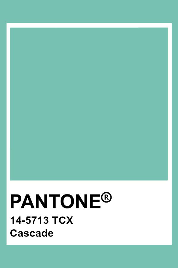
Photo Credit: Pinterest
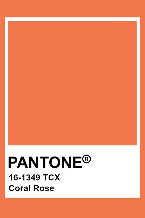
Photo Credit: Pinterest
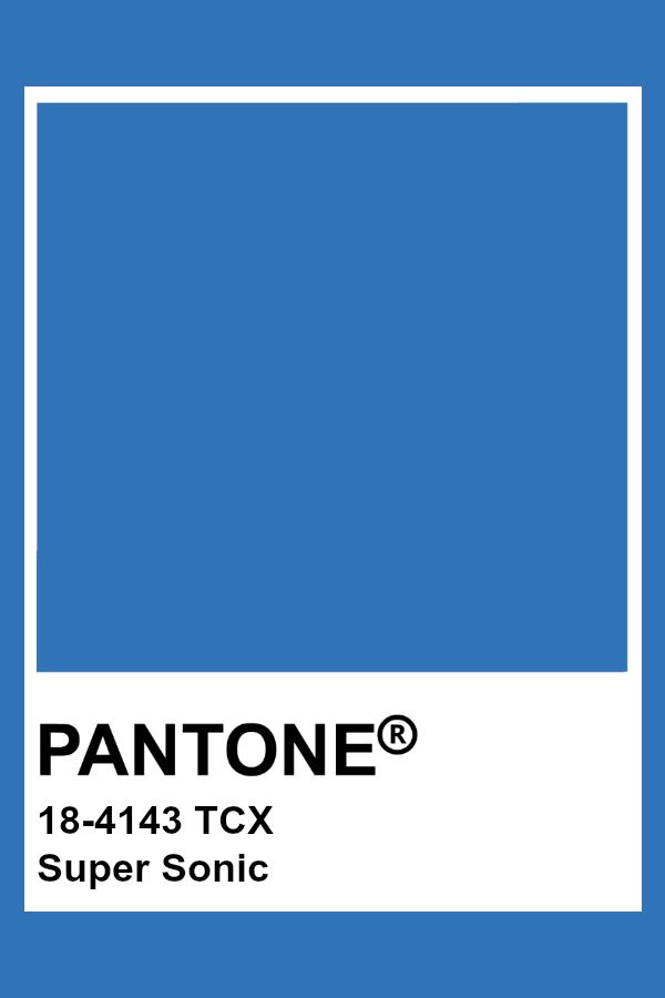
Photo Credit: Pinterest
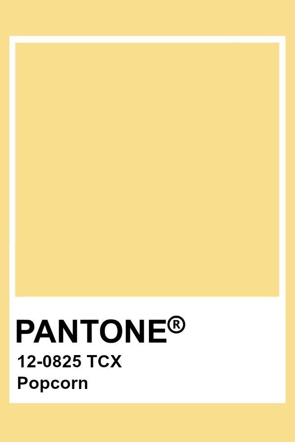
Photo Credit: Pinterest
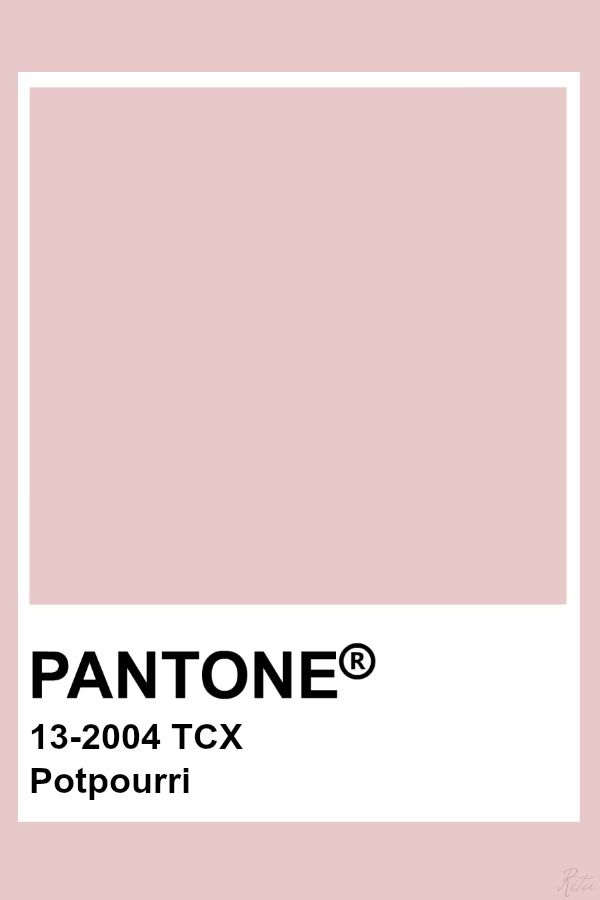
Photo Credit: Pinterest
Pantone’s Color Institute, the segment in charge of trend forecasting and colour consultancy, publishes a guide to the latest colour trends accompanying each fashion season. The Fashion Colour Trend Report features a top ten colours list as well as five core classic colours. On September 16th, Pantone released its Fashion Colour Trend Report for London Fashion Week, with colours expected to be seen during the Spring-Summer 2022 fashion shows in the English capital. Colours pointed by this report are a blend of sentiments of simplicity and spontaneity, inspiring new forms of personalized expression, and include:
– Pantone 14-5713 – Cascade: cool, refreshing green connected to cleansing waters
– Pantone 16-1349 – Coral Rose: vivid and energizing floral rose tone with a sense of excitement
– Pantone 18-4143 – Super Sonic: vibrant blue colour, electric in intensity
– Pantone 12-0825 – Popcorn: bright and radiating warmth yellow
– Pantone 13-2004 – Potpourri: carefree and lighthearted pastel pink
– Pantone 17-1928 – Bubblegum: with a positivity and playfulness message, this pink tone is eye-catching
– Pantone 18-1160 – Sudan Brown: earth brown tone naturally rich and tied to the great outdoors
– Pantone 15-0549 – Fragile Sprout: visually arresting, this green colour is acidic and sharp
– Pantone 14-3612 – Orchid Bloom: lilac tone reminiscent of nature’s florals
– Pantone 18-1307 – Coffee Quartz: both basic and glamourous, a brown colour filled with flavour
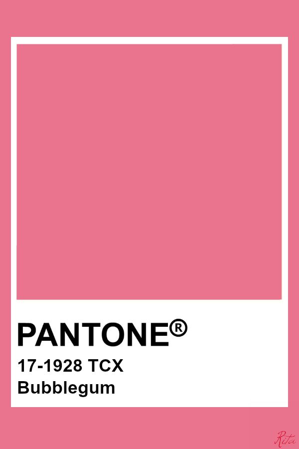
Photo Credit: Pinterest
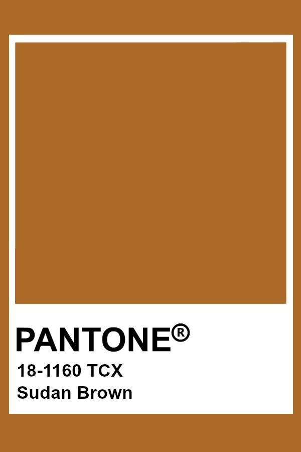
Photo Credit: Pinterest
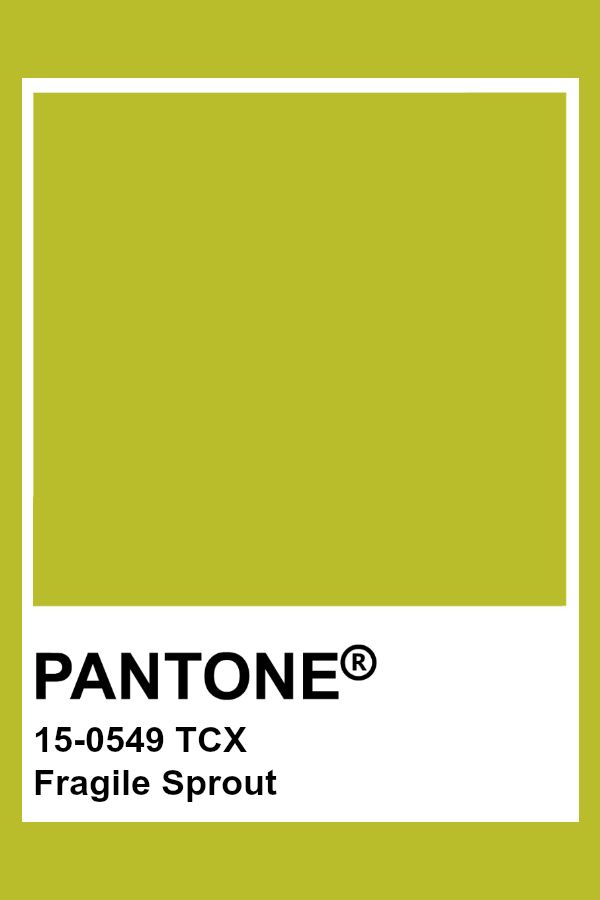
Photo Credit: Pinterest
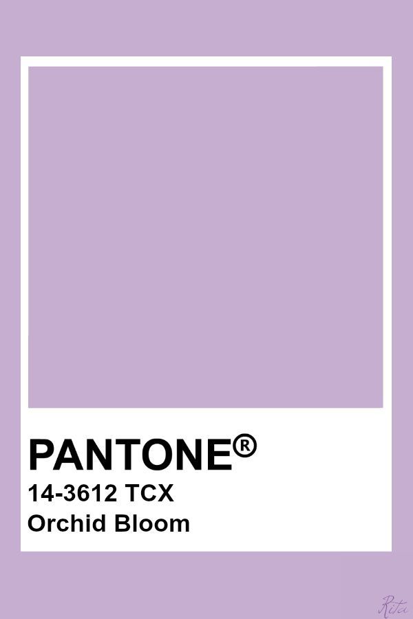
Photo Credit: Pinterest
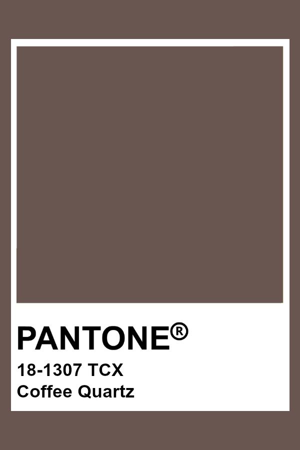
Photo Credit: Pinterest
In addition, the core classic colours for LFW SS2022 were defined as:
– Pantone 11-1001 – White Alyssum: a clean and clarifying white amidst chaos supporting simplicity
– Pantone 15-1304 – Humus: tasty brownish tone promoting well-being and comfort
– Pantone 15-6316 – Fair Green: restful, restorative and calming green
– Pantone 14-4104 – Northern Droplet: pale grey that incites tranquility feelings
– Pantone 18-4004 – Poppy Seed: timeless, familiar and deep grey
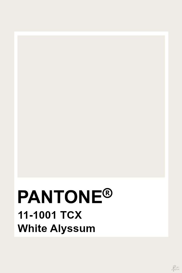
Photo Credit: Pinterest
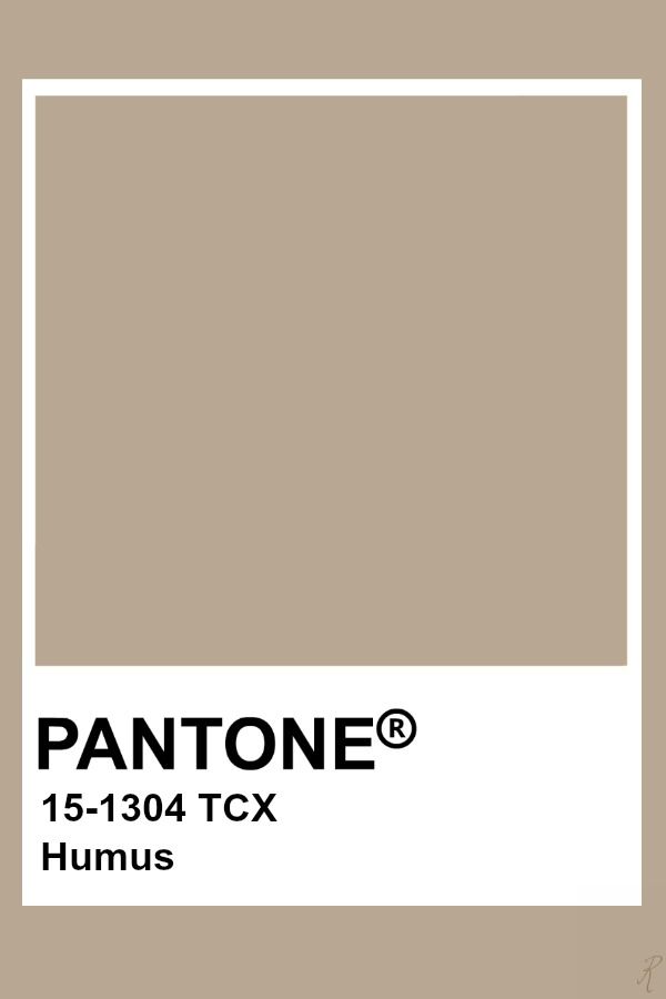
Photo Credit: Pinterest
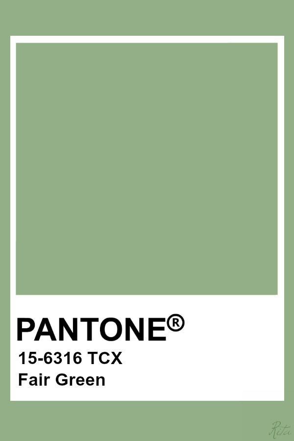
Photo Credit: Pinterest
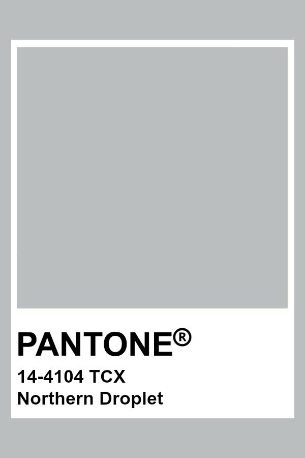
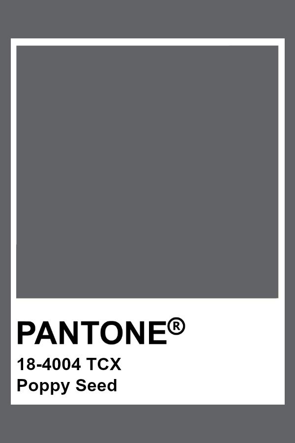
Photo Credit: Pinterest
According to Pantone’s LFW SS2022 report, designers would choose the above-mentioned colours for their collections as they symbolize a deep connection with nature and a need for feelings of comfort and familiarity. The tones in this report are refreshing pastels, bright and cheery colours and neutrals, meaning they are complementary and contrasting at the same time. The selected colours inspire “playful creativity and unconstrained visual expression that is full of life”, according to Leatrice Eiseman, Pantone Color Institute’s Executive Director. She also affirms that the way we use colour is connected to our mood so, as we enter a new, uncertain future, we look for opportunities to do everything in a different way.
Published by HOLR Magazine.