
A studio can feel open and calm without changing the floor plan. The secret lies in what the eye notices first, then how it moves across the walls. With smart scale, negative space, vertical lines, and reflected light, art can shape the room as effectively as furniture.
This approach trades visual fragmentation for curated scale. Think one generous focal piece, a few supporting elements, and purposeful gaps. The result is height, depth, and order that make a compact home feel composed and airy.
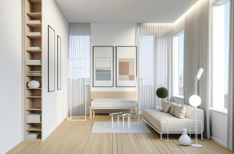
The big art blueprint for an airy studio
Start high with one statement piece
Begin with a single oversized print in 24×36 or 30×40 inches. Mount it so the top edge sits about 6 to 8 inches below the ceiling. This placement pulls sightlines upward, reads as architectural, and instantly reduces clutter compared with many small frames. A tall 24×48 inch option can create an even stronger vertical sightline, especially in studios under 400 square feet.
Portrait formats work well because they naturally emphasize height. For an easy start, explore stylish posters in minimal palettes, then pair the focal piece with a slim 18×36 inch mirror across from a window to reflect daylight and add perceived depth.
Let empty space do the heavy lifting
Negative space is not an accident, it is a tool. Aim to keep roughly 30 to 40 percent of a primary wall clear, then group supporting prints within the remaining area. Maintain 4 to 8 inches between frames so the eye reads one cohesive composition rather than a busy collage. Around the cluster, preserve at least 4 inches of breathing room to keep edges crisp.
Color restraint helps the layout feel unified. A dominant two color story, or two to three tones at most, prevents fragmentation and keeps the wall quiet. Many designers advise choosing a few larger pieces over many small ones to make compact homes feel bigger, guidance outlined by The Spruce in its overview of how larger scaled decor increases perceived space.
Stack vertical cues for more height
Reinforce the upward pull with layered vertical elements. Combine floor to ceiling curtains or a tall bookshelf with portrait posters to build momentum; tips for hanging curtains help determine rod position and header height. Keep the top of the main artwork 6 to 8 inches from the ceiling, then stagger supporting prints every 8 to 12 inches down the wall. This anchor, reflect, and stagger sequence yields an immediate sense of order and height.
Subject matter can help too. Imagery with vertical lines, like tall trees or architectural shots, acts like visual scaffolding that draws the gaze up. For extra brightness, place reflective artwork or a metallic accent print across from natural light, which increases ambient glow and makes the room feel more expansive.
Small moves, big room energy
A few clear rules can transform a studio. Lead with one large piece hung high, give it generous negative space, and layer vertical cues that lift the eye. When art sets height, order, and light, the walls do the space making.