
In a fashion landscape often shaped by fast-moving trends and seasonal statements, color continues to play a quiet yet defining role. Rather than overwhelming the eye, today’s most compelling palettes are those that feel considered, adaptable, and grounded in everyday life.
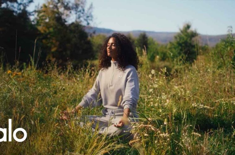
Alo Yoga’s Spring 2026 collection reflects this shift through a series of distinct yet harmonious shades—Vintage Pink, Oatmeal Heather and Gravel, Sunshine, Desert Sage, alongside newly introduced tones like Light Provence Blue and Olive Tree. Together, they form a palette that moves fluidly between softness, warmth, and understated confidence.
A Seasonal Palette Rooted in Versatility
Spring dressing often leans toward predictable pastels, yet this season introduces a more nuanced approach to color.

Vintage Pink brings a sense of nostalgia, offering a softened tone that feels both familiar and refreshed. It captures the essence of spring without becoming overly delicate, making it adaptable for both activewear and everyday styling.

In contrast, Oatmeal Heather and Gravel introduce a pair of comfort-driven neutrals. These tones emphasize balance—neither stark nor overly warm—creating a foundation for effortless layering. Their pairing suggests a move toward coordinated dressing, where pieces are designed to work together rather than stand alone.

Sunshine, as the name suggests, shifts the palette toward brightness. Yet instead of a bold, high-saturation yellow, it carries a controlled vibrancy. It adds energy to a wardrobe without disrupting its overall cohesion, making it an accessible entry point for those exploring color.

Desert Sage offers a grounded, nature-inspired tone. It reflects the continued influence of earth-based palettes in contemporary fashion, reinforcing a sense of calm and balance within modern dressing.
Expanding this narrative, Light Provence Blue introduces a sense of clarity and airiness. With its soft, cool undertone, it evokes open skies and coastal light, bringing a refreshing contrast to the warmer hues in the collection. It functions as a transitional shade—equally suited to minimalist styling or layered combinations.
Olive Tree, on the other hand, deepens the palette with a richer, more grounded green. Slightly more saturated than Desert Sage, it adds depth without heaviness, offering a refined take on utility-inspired color. Its versatility allows it to move seamlessly between activewear and more structured, everyday looks.
Beyond Trends: The Evolution of Everyday Color
Color in contemporary fashion is no longer about seasonal novelty alone. It increasingly reflects lifestyle shifts—toward mindfulness, flexibility, and intentionality.
The Spring 2026 palette aligns with this evolution. Each shade serves a different purpose:
- Soft tones for ease and familiarity
- Neutrals for structure and layering
- Bright accents for energy
- Earth tones for grounding
- Cool hues for clarity and lightness
Rather than competing, these colors coexist, allowing wearers to move between moods and settings without needing entirely separate wardrobes.
This approach mirrors how people dress today. Clothing is expected to transition seamlessly across activities—morning routines, work-from-home schedules, casual outings, and moments of rest. A cohesive color system makes this transition feel natural rather than forced.
A Modern Minimal Aesthetic
Minimalism today is less about reduction and more about precision. It focuses on clarity in silhouette, intention in fabric, and harmony in color.
Across the Spring 2026 collection, clean lines and wearable shapes remain central. Pieces are designed to move with the body while maintaining a structured, polished appearance. There is a noticeable absence of excessive detailing, allowing color and texture to take precedence.
This restraint creates space for versatility. A Vintage Pink set can feel soft and elevated, while a Desert Sage or Olive Tree look leans more grounded and understated. Light Provence Blue introduces a sense of openness, while Oatmeal Heather and Gravel function as transitional anchors. Sunshine, meanwhile, adds contrast without overwhelming the overall look.
The result is a wardrobe that feels curated rather than constructed—where each piece contributes to a cohesive visual language.
Lifestyle Integration Beyond the Studio
While rooted in activewear, the collection extends naturally into everyday life. The boundaries between performance wear and daily dressing continue to blur, and color plays a key role in that transition.
A neutral base like Oatmeal Heather can anchor a layered outfit, paired with outerwear or tailored pieces. Vintage Pink softens structured looks, adding warmth without excess. Light Provence Blue introduces freshness into minimal combinations, while Sunshine works as a focal point, brightening otherwise understated outfits. Desert Sage and Olive Tree, meanwhile, offer adaptable options that integrate easily into both casual and elevated styling.
These combinations reflect the rhythm of contemporary living. Few wardrobes today are divided into strict categories. Instead, clothing must adapt to hybrid routines and shifting environments.
By offering a palette that supports this flexibility, the collection emphasizes continuity—allowing individuals to move through their day with ease and coherence.
Texture, Tone, and Subtle Contrast
When color is thoughtfully controlled, texture becomes more visible. Matte finishes, soft ribbing, and smooth performance fabrics interact differently with each shade, creating quiet variation across the collection.
In lighter tones like Vintage Pink and Oatmeal Heather, texture adds depth without heaviness. In deeper or richer shades like Desert Sage, it enhances dimension. Sunshine, meanwhile, captures and reflects light in a way that brings subtle energy to even the simplest silhouettes.
These nuances encourage a more intentional approach to styling. Whether worn as coordinated sets or mixed with existing wardrobe staples, the pieces allow for personal interpretation while maintaining visual balance.
A Quietly Confident Color Story
In an era defined by rapid micro-trends and constant visual stimulation, there is a growing appeal in restraint. Color does not need to dominate in order to make an impact. Instead, it can support, enhance, and unify.
Alo Yoga’s Spring 2026 collection captures this perspective through a palette that feels both diverse and cohesive. Each shade contributes to a broader narrative—one that prioritizes wearability, adaptability, and understated elegance.
Rather than presenting color as a fleeting statement, the collection positions it as a lasting element of modern style. And in that quiet consistency lies its strength.
Published by HOLR Magazine.